

blog15 | 10 | 2026
No executive dashboard fails for lack of data. It fails because it answers questions nobody at that table asked.
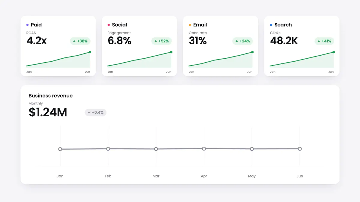
Monthly business review. Paid is at a 4.2x ROAS, up on last month. Social grew engagement. Email lifted its open rate. Search brought the CPC down. Every channel has its slide and every slide is green. And then, always about thirty seconds in, comes the one question none of those slides answers: so why is revenue flat?
That is siloed optimization: every platform measured against its own benchmark, in its own currency, with its own definition of a conversion. Meta reports the conversions Meta claims. Google reports the ones Google claims. Web analytics reports sessions. The CRM reports opportunities. Added up they produce a number that appears on no financial statement, and not one of the four explains on its own why revenue moved or stalled.
The problem has been measured. Gartner's 2026 marketing survey, covering 426 senior marketing leaders, found that 84% of companies are caught in what it calls a brand doom loop: too little invested in measurement, results nobody quite trusts, and therefore even less funding next time. A circle that closes on itself, and it starts with the report.
The finding that should move anyone building a dashboard sits in that same 2026 report: more than half of the C-suite wants marketing to clarify how its work connects to business strategy, and 43% want a clear, simple story about performance. They are not asking for more metrics. They are asking for a translation.
A cross-channel marketing dashboard for executive reporting is not built to show everything you measure. It is built to turn a scattered set of channel reports into a financial decision system: what changed, why it changed, and what we do now. Here is the full architecture, above the screen and below it: three levels of hierarchy, the data layer that holds them up, five layout modules, a cadence per audience, and an explicit list of what stays out.
The tension
Channel reporting does not lie. It optimizes. Every team does its job well inside its own platform, and every platform has a structural incentive to claim the conversion. The result is a report where everyone wins and nobody can explain the consolidated picture.
The underlying problem is not instrumentation, it is the denominator. As long as the executive report is the sum of the channel reports, you are comparing a platform ROAS against a business CAC, and a lead against a CRM opportunity. Three different currencies in the same table.
Confusing the two terms explains much of the problem, and it is not a semantic quibble: it defines which question your dashboard can answer.
| Dimension | Multi-channel report | Cross-channel report |
|---|---|---|
| Unit of analysis | The channel. One tab per platform | The customer journey. One path that crosses platforms |
| Headline metrics | Clicks, CTR, platform ROAS | Blended CAC, LTV, assisted conversions, attributed revenue |
| What it does with overlap | Nothing. Every platform claims the same conversion | Resolves it with a declared attribution model and a single denominator |
| Question it answers | How did each channel do? | Which combination of channels moved the business? |
This is the line that separates genuine omnichannel reporting from a stack of channel exports. Most dashboards presented as cross-channel are multi-channel with the tabs placed side by side. You can spot it in a second: if you can add up the conversions from every card and the total matches no figure the business recognizes, it is multi-channel.
Underneath that report sits a pile of tools nobody planned. The martech landscape reached 15,505 products in 2026, according to the State of Martech report from chiefmartec and MartechTribe. And Gartner's 2025 marketing technology survey found that only 49% of the capabilities organizations pay for actually get used, with just 15% of organizations qualifying as high performers. Every tool that joins brings its own schema, its own definition of a conversion and its own attribution window. Fragmentation is not an accident of the stack. It is its default state.
The last two numbers come from the IAB State of Data 2026 report, produced with BWG Global across 430 senior planning and analytics decision-makers at U.S. brands and agencies. The time figure is the one that stings: four in every ten hours of the team that should be interpreting go to sourcing, cleaning and matching data before anyone can look at anything.
The work that comes out of it does not fully convince either. On attribution specifically, 72% say it does not capture performance across all channels, 73% say it is not cross-validated against any other method, and 66% say it does not arrive in time to inform planning. This is not a dashboard problem: the dashboard's raw material arrives late and incomplete.
Julie Reeves, a Gartner analyst, sums it up in the 2026 report with an idea worth taping to your monitor while you design: stop tracking metrics in isolation and start showing how they move enterprise priorities, meaning revenue, profit, customer experience and market expansion.
If the executive has to interpret your dashboard, you have already lost the meeting.
So the real discussion is one of information design: what gets shown first, what it is compared against, who owns each number, and how often it refreshes. What follows is how to settle those four things.
The separation
The most expensive mistake of all is trying to make one dashboard serve both the CFO and the campaign manager. It is not a question of how many metrics to show: they are two different products because they enable different decisions. One decides where the capital goes. The other decides which bid gets adjusted today.
The separation is not a recent invention. Stephen Few, in Information Dashboard Design, already distinguished strategic, analytical and operational dashboards by the kind of decision they support, and Avinash Kaushik has spent years arguing in Web Analytics 2.0 that a report with no action attached to it is a cost, not an asset. What changed is the number of sources you have to reconcile before you reach that screen.
| Dimension | Strategic (executive) | Tactical | Operational |
|---|---|---|---|
| Audience | CEO, CFO, CMO, board | Channel directors, team leads | Analysts, campaign managers |
| Decision | Capital allocation and strategy | Channel mix, spend reallocation | Bids, segments, creative |
| Cadence | Monthly or quarterly | Weekly | Daily or continuous |
| Typical metrics | Blended CAC, LTV, attributed revenue, margin | Leads by channel, conversion, ROAS | CTR, CPC, CPL, budget pacing |
| Navigation | One or two clicks to root cause | Two or three levels | Unlimited exploration |
| Question | Are we where we should be, and what changed? | Where do I move budget? | What do I adjust now? |
The practical way to distribute metrics across those three levels is to draw the tree first, an exercise Lisandro Iserte lays out well in his guide to marketing dashboards. The trunk holds the end results the business is chasing: revenue, CAC, LTV. The branches are the mechanisms that move them: qualified leads, conversion rate, channel mix. The leaves are the inputs someone controls by hand: CTR, CPC, bid, daily budget.
If a metric cannot find its place in the tree, it probably has no place on any dashboard. And if it sits on the trunk but nobody knows which branch moves it, the problem is not visualization: the model is missing.
The other cut that organizes the screen is time. Leading indicators anticipate: qualified leads, meetings booked, pipeline created, quota coverage. Lagging outcomes confirm: win rate, closed revenue, ROMI, churn. An executive dashboard that shows only the second kind is a well-designed rear-view mirror: accurate, useless for braking. One that shows only the first is a promise with no accountability attached. The top band needs both, and it needs to be obvious which is which.
The five-second rule
Five seconds of looking, with nobody explaining anything, should be enough for three things: grasp the overall health of the business, see whether you are tracking against the period's budget, and spot the anomaly that demands intervention. If within that window the executive had to ask "what does this measure?", the module is badly built or simply does not belong.
The same discipline applies when the dashboard gets presented live. Guy Kawasaki's 10-20-30 rule (ten slides, twenty minutes, 30-point type) was written for investor pitches, but it solves the same problem: it forces the presenter to choose. If you could project only one slide from the entire dashboard, that is the one that matters. Everything else is backup.
The same goes for the source. A single governed data layer, the familiar single source of truth, is not an architectural indulgence: it is what stops marketing arriving with one number and finance with another. If the CFO's number does not match yours, the meeting is no longer about the business: it is about who is right.
The architecture
A cross-channel marketing dashboard earns its place through structure, not through volume. The one that works orders the screen top to bottom by importance, not by data availability. The conclusion goes at the top: whether you are inside or outside the plan. The detail that explains that conclusion goes below. And each level exists solely to answer the question the one above it left open, so whoever wants the headline keeps the headline and whoever wants the why goes down to find it.
There is a simple way to check the hierarchy is sound: each level should map to one of the three questions asked in every business review. What changed. Why it changed. What we do now. If a module answers none of the three, it does not belong.
Level 1 · Status · What changed?
The financial health of the business, in one band
Between five and nine macro indicators, and not one of them broken out by channel. Attributed revenue, blended CAC, global ROAS, pipeline coverage, contribution margin. This band explains nothing: it states whether you are inside or outside the plan. It is the one read in five seconds.
Level 2 · Diagnosis · Why did it change?
Contribution by channel and by funnel stage
This is where paid media, owned media, social media and search appear, and where the funnel appears. Its only job is to answer why level 1 looks the way it does: which media type is driving growth, which is holding it back, and at which stage efficiency leaks.
Level 3 · Action · What do we do now?
Exceptions, owners and bounded drill-down
Filters by region, brand or campaign under the two clicks to root cause rule, and above all alerts with an owner: budget variance beyond 10%, anomalous conversion drops, reputation flags. An alert with no name beside it is not an alert. It is a notification.
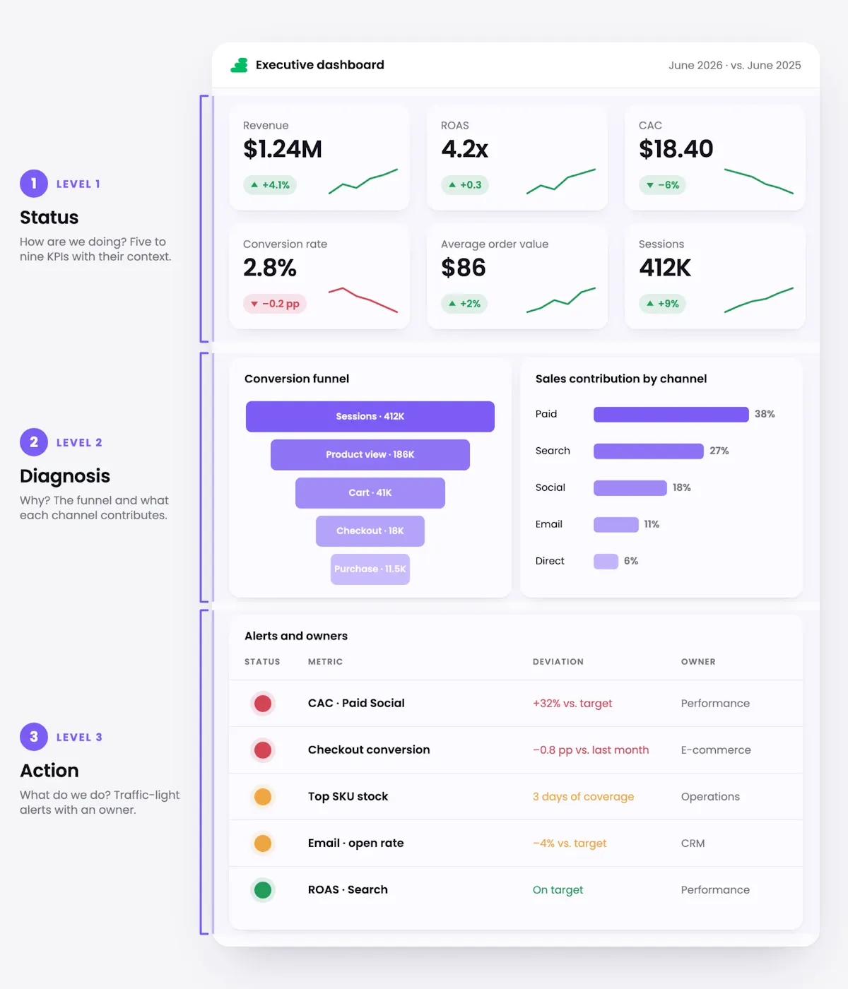
The rule that keeps the hierarchy honest is simple: no number at level 2 may contradict level 1. If the sum of contribution by channel does not reconcile with the attributed revenue above it, you do not have a dashboard: you have two reports glued to the same screen.
At level 2, the natural reflex is to rank channels by their platform ROAS. It is the worst possible criterion, because it compares metrics no two platforms calculate the same way. Rank them by contribution to the same denominator (attributed revenue or pipeline created, with the attribution model declared above the table) and put spend alongside. Then the comparison means something.
That level is also where strategic imbalances surface that channel reporting keeps invisible. Gartner's 2026 CMO spend survey, covering 401 CMOs and marketing leaders across North America, the United Kingdom and Europe surveyed between January and March 2026, shows that awareness and conversion now absorb 62.6% of media investment, more than ten points above 2024, while spend on loyalty and retention fell 29% to below 15%. An executive dashboard that only shows acquisition performance will never expose that shift. One organized by funnel stage puts it on the table without anyone having to ask.
IAB / BWG Global · State of Data 2026
The dollars planners would shift toward channels currently underrepresented in their models if those models were more accurate and more trusted: 5.6% more investment across total U.S. ad spend. What the dashboard represents poorly does not get funded.
The dashboard exists so that story can be told in five seconds. In Gartner's 2026 marketing survey, 43% of the C-suite asked for exactly that: a clear, simple story about performance. And the recurring conversation around it, with the same people on the same cadence, is what turns that story into a decision.
The layer below
A dashboard is the last layer in a chain, and it inherits every problem from the ones before it. If a conversion arrives misclassified at the source, no choice of chart will fix it. So it is worth knowing the whole chain before anyone argues about colors.
The dashboard is step six. Almost every "that number doesn't look right" argument is born in step four.
Signal loss changed what level 2 is made of. With third-party cookies in retreat, consent mandatory and platforms closing their boxes, much of the pre-conversion journey no longer travels identified. The answer is not to give up on the upper funnel: it is to change the raw material. Server-side capture so you do not depend on the browser, consented first-party data as the backbone, and anonymous intent signals (repeat visits to product pages, consumption of technical content, firmographic patterns in B2B) that let you qualify demand before a CRM record exists.
This has a direct consequence for the executive view: level 1 can no longer rest on a single browser-side source of truth, and instead rests on a model. Stating which model, right above the table, stops being a technical footnote and becomes part of the number's credibility.
For level 2 to reconcile with level 1 you need a concrete structure, and it is simpler than it sounds. At the center, a touchpoint fact table: one row per touchpoint, with its timestamp, channel, campaign, cost and person or account identifier. Around it, the dimension tables: account or customer, campaign, product, region, period.
With that shape, every question the committee asks becomes a query against the same base rather than a request to a different team. "What did it cost us to acquire a customer in this segment in this region" stops being a two-week project. Without that shape, every new view is a new report, and two new reports already start contradicting each other.
Last-click remains the silent default in most dashboards, and it is what produces the scene from the opening: every platform claiming the same sale. That is not an impression: in the IAB survey, 49% use platform-level attribution and another 49% last-touch, against just 39% using multi-touch and 34% using algorithmic models. The approach that has taken hold does not replace one model with another: it puts them to work together on different jobs.
| Method | What it is for | Where it fails alone |
|---|---|---|
| MTA · multi-touch attribution | Day-to-day tactical optimization and credit allocation across digital touchpoints | Blind to anything untracked, and signal loss keeps trimming its upper funnel |
| MMM · marketing mix modeling | Medium and long-term budget planning, offline media included | Coarse granularity and high latency: no use for deciding on a Tuesday |
| Incrementality | Validating causality with geo-experiments and holdouts: what would have happened without that spend | Expensive in time and design; you cannot run it across everything at once |
The finding from the IAB State of Data 2026 that should worry anyone building a dashboard is not about technology: no channel is fully represented in today's marketing mix models. Among those with visibility into each channel, 77% say gaming is underrepresented, 50% say commerce media, 48% creator and influencer, and 46% the rest of traditional media, meaning radio, print, out-of-home and direct mail. The effect is familiar: the model rewards what is easy to measure (display, search, social) and penalizes what moves the business but does not report through an API.
For level 2 that means one uncomfortable, necessary rule: if a channel does not fit the model, it still appears in the table, flagged as unmodeled. A zero by omission reads exactly like a zero by performance, and that confusion has already cost entire budgets.
The filter
Adding a metric to the executive view is not free: each one competes for the same five seconds. And because it costs almost nothing technically, the temptation is enormous. Three families never make it in, for different reasons.
The actionable metric test
Croll and Yoskovitz put it in one line in Lean Analytics, building on the actionable-metric idea Eric Ries established in The Lean Startup: a good metric changes your behavior. The practical version for a dashboard is a single question. If this number jumped 30% tomorrow, would we do anything differently? If the answer is no, the metric does not belong in the executive view. It can be true, interesting, and still surplus.
There is also a numeric ceiling worth respecting. Level 1 lives between five and nine cards, and the full executive screen should not exceed twelve KPIs across all three levels. Past that number the eye stops prioritizing and starts sweeping, which is precisely the opposite of what the dashboard is for.
If the goal is for marketing to stop being a cost line in the conversation, the set has to speak finance's language. Four metrics do most of that work:
The practical way to close the filter is not to design a generic executive dashboard, but one per role. Every seat at that table has a different decision and therefore a different primary set.
| Role | Primary KPIs | What should not appear here |
|---|---|---|
| CEO | Attributed revenue growth, market share, blended CAC, retention and churn, global ROAS | Individual channel metrics, unqualified web traffic, isolated social engagement |
| CFO | Contribution margin, budget variance, CAC payback, CLV:CAC ratio, cash flow impact | Clicks, CPC, raw impressions, blog traffic |
| CMO | Marketing-attributed revenue, sourced and influenced pipeline, cost per opportunity, qualified MQLs, ROMI by campaign | Followers, CTR on a single ad, open rate on one email |
| VP of Sales | Pipeline coverage, MQL to opportunity conversion, pipeline velocity, expansion revenue | Individual daily activity, landing page visits |
One dataset, four views. It is more governance work and less design work than it looks: if the definitions are written once and written well, the four views are filters on the same base, not four parallel reports that stop agreeing within three months.
The clock
Real time is a capability worth having. It is what lets you kill a campaign that broke mid-morning, catch a tracking drop the same day instead of on Monday, or reach a reputation alert while there is still something to be done. The question is not whether to have it. It is which layer it pays off for.
A budget reallocation decision is read against a stabilized series, because what you are looking at there is a trend and not a moment. The same data, two different clocks, and both of them right.
The decision each level enables explains the scale: at the top, capital gets reallocated and strategy adjusted; in the middle, the channel mix and paid media spend get rebalanced; at the bottom, an ad gets paused. Continuous refresh pays off most where the decision is continuous too. In the executive band the value sits elsewhere: in the series arriving consolidated and comparable, so the conversation is about what to do rather than whether this morning's number has already moved.
That tension between short and long term has been measured. In The CMO Survey's spring 2026 edition, covering 308 marketing leaders at U.S. companies surveyed between January 7 and 29, 2026, 97% of them VP level or above, more than 70% reported prioritizing immediate results over long-term ones. That is where the executive view earns its keep: putting the long series beside the period's number, so short and long term get discussed on the same screen instead of in separate meetings.
The AI layer has moved in the last two years. It stopped being a chat window bolted onto the report and took over three jobs a person used to do by hand, each stacked on the one before:
The IAB State of Data 2026 puts numbers on that transition: around half of the buy-side is already scaling AI inside its advanced measurement frameworks, and of those who are not, more than 70% expect to within one or two years. The study estimates AI could unlock 32 billion dollars of value over that horizon, 26 billion in better-allocated investment and 6 billion in productivity.
The fine print in the same report is worth reading. Today AI is used mostly for the heavy data lifting: collecting, cleaning, labeling and normalizing before a human interprets. Automated interpretation only appears on the list of what is expected one to two years out. And half the buy-side anticipates serious obstacles along the way, tied to legal risk, security, accuracy and data quality. So a dashboard that recommends has to always show what it is resting on: the assumption, the data window and the source, right next to the recommendation. That traceability is what gets the proposal accepted in the meeting instead of filed as a suggestion nobody acts on.
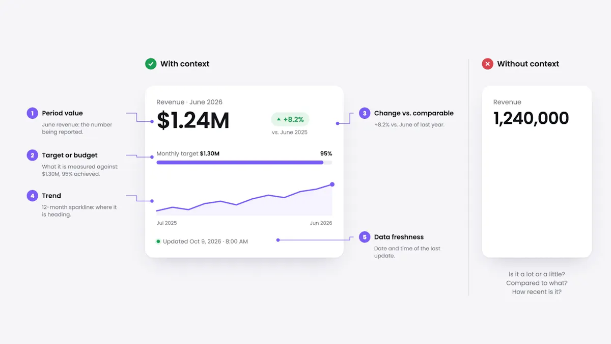
A number without context is a number that can be argued with. Every metric card at level 1 has to carry five elements, without exception:
The template
With the hierarchy, the data layer, the filter and the cadence settled, the layout of a cross-channel marketing dashboard almost writes itself. Here is the five-module blueprint: where each one goes following the F-shaped reading pattern, in what visual format, and above all which question it answers. If a module answers no question anyone actually asks, take it out.
| Module | Position and format | Question it answers |
|---|---|---|
| 01Macro business health | Top band. KPI cards with sparkline and status color: attributed revenue, blended CAC, global ROAS, pipeline coverage | Are we meeting the period's financial and growth targets? |
| 02Funnel conversion | Middle left. Horizontal funnel: TOFU → MOFU → BOFU, MQLs, opportunities created, closed deals | At which stage is efficiency being lost? |
| 03Contribution by channel | Middle right. Grouped bars with variance against target: spend and return across paid media, owned media, social media and search, with unmodeled channels flagged | Which combination of channels is making the budget work? |
| 04Long-term trend | Lower left. Lines with moving average and projection: CLV, CAC payback, pipeline velocity | Is the growth trajectory sustainable? |
| 05Alerts and exceptions | Lower right. Summary table with status colors and owner: budget variances above 10%, anomalous drops, reputation flags | Which deviation needs intervention this week? |
The build order matters as much as the layout, and it is almost always done backwards. People start by picking a tool and end up hunting for something to show. It goes the other way around:
utm_source for the platform, utm_medium for the traffic type, utm_campaign for the business initiative, utm_content for the creative variant, always lowercase and with no synonyms. Nine out of ten arguments about "this channel does not add up" are a broken taxonomy, not a broken model.Of the five, step 2 is the one that decides the outcome. The metric dictionary never shows up on screen and never shines in a demo, but it is what makes the same question return the same answer in March and in September, whoever is on the team.
One definition per number. That is what makes a dashboard trustworthy.
Bunker Analytics is our marketing analytics platform: it brings paid, owned, social, search, web and CRM into one cross-media reporting layer, with its own taxonomy, a KPI dictionary, variance alerts, and permissions by brand and region so every seat at the table sees its own view and not the one next to it. Spend that has no API (native, in-house DSPs, TV, out-of-home) enters as another channel rather than an annex stapled to the end, which is exactly the gap the IAB found in the industry's models. And if you need to settle the attribution discussion with MMM, incrementality or GeoLift, Marketing Science builds on the same foundation instead of replacing it.
What changes is not the report: it is the meeting. Instead of four slides in the green and a question with no answer, the committee opens one screen, sees in five seconds whether it is inside the plan, understands why at the second level, and leaves with a decision made and an owner beside it.
Lucas Suarez
Marketing Analyst
1/9


