
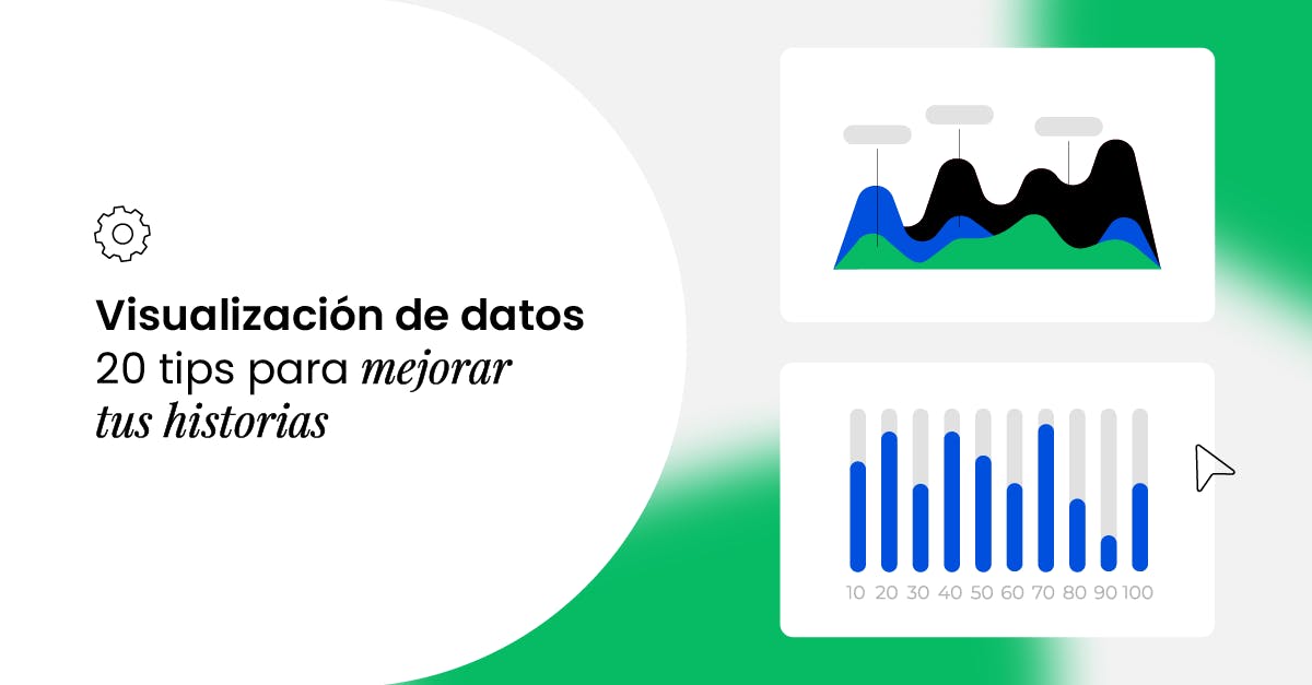
Visualization 102: 20 criteria for visualizing data

As we saw in Data Visualization 101: The 9 Essential Principles of Data Storytelling, data communication and visualization are becoming a second language for business. After covering those nine fundamentals, let’s take it one step further and unpack five key components:
✅ If your comparison isn’t immediate and compelling, it doesn’t communicate.
✅ If your text isn’t strategic, it only confuses.
✅ If your labels don’t guide the eye, they muddle the message.
✅ If the order doesn’t make sense, all your effort goes to waste.
✅ If color doesn’t clarify, it distracts.
In this article, we’ll share 20 practical tips across these five areas so you can sharpen your skills and create visualizations that truly make an impact.
Comparisons: compare is more than just showing

1. Include a zero baseline and reference lines
Start your charts at zero so differences are scaled correctly. While there are exceptions, this ensures readers won’t wonder if the data’s been skewed. Add benchmark or target lines (e.g., dots or horizontal guides) to show whether values sit above or below your reference.
2. Choose the most efficient visualization
The prettiest chart isn’t always the clearest. Use stacked or grouped bars, line charts, or distribution plots based on your goal—direct comparison, trend analysis, or spread. Comparisons should be instant and effortless. When contrasting time periods (MoM, QoQ, YoY), use a dashed line for your previous period and a solid line for the current one.
3. Mind sizes, positions, and layouts
Use area and length to highlight magnitude—larger shapes mean bigger values. Position data thoughtfully: moving away from zero will make that element stand out. And keep related charts or elements close together—if they’re visually too far apart, you lose the point of comparison. Your layout should guide the eye seamlessly from one element to the next.
4. Tell the full story
Don’t stop at a one-off increase. “30% growth in 2024” is fine, but if that growth actually doubled your performance, that’s the real headline. Provide context so readers grasp the true scale of your results.
Text: when copy and visuals complement each other

5. Don’t over-explain or fall into redundancy
Your text should add clarity, not confusion. If a data point appears in the narrative, you don’t need to echo it in every element. The chart title, axis label, and callout each have their own hierarchy—use them to complement, not repeat, one another.
6. Use simple titles to anchor your message
Skip cryptic or overly clever headings. Your title should plainly state what we’re looking at, what to focus on, and why it matters—no frills. The clearer the title, the faster readers grasp your point.
7. Deploy callouts with clear intent
A callout should spotlight one key insight or add necessary context. Don’t use it just to fill space—use it to draw attention or explain something the chart alone can’t. This is especially useful in seasonal industries (e-commerce events, academic semesters, vacation peaks, etc.).
8. Avoid distracting fonts or design elements
Choose legible, understated typefaces. Reserve bold or italics for true emphasis—and never both at once. Keep decorative elements to a minimum so your data remains front and center.
Tags: small, but mighty

9. Verify your chart is correctly labeled
Trust in your data starts with accurate labeling. Eliminate typos, duplicate values, or missing labels. Don’t hide legends or labels behind other elements—every data point must be clearly linked to its value. Luckily, many modern analytics tools offer automatic labeling features to help marketing teams maintain consistency (ie. automatic tagging for social media comments).
10. Label directly on the line or point
Reduce your reader’s cognitive load by placing labels next to the line or marker itself, so they don’t have to hunt for a separate legend. Avoid angled text—keep labels horizontal for easier reading.
11. Avoid over-labeling
Labels define your visualization: too few and it’s confusing; too many and it’s cluttered. If exact numbers aren’t essential to your message, leave them out—sometimes a clean trend line speaks louder than every data point. When space is tight, show only the key values.
Order: not just a detail, but a mental framework

12. Order information intuitively
The sequence of data directly affects comprehension. Random patterns create confusion. Always apply a clear logic—alphabetical, chronological, or by magnitude.
13. Maintain consistency
The order of categories in your legend should match the visual order in the chart. It seems obvious, but this alignment is often broken, making charts harder to read.
14. Use regular axis increments
Avoid uneven steps like 0, 3, 5, 16, 50. Stick to natural, predictable scales (e.g., 0, 5, 10, 15…) so readers can follow values at a glance.
Color: a reading pact that guides comprehension

15. One metric, one color
Color is a powerful organizer—when used consistently, it clarifies; when abused, it confuses. Don’t change the color of each bar if they all represent the same metric. Consistency speeds comprehension.
16. Respect positive vs. negative cues
Red usually signals loss or warning; green signals growth or success. Never use red for a positive value—you’ll only confuse your audience.
17. Ensure sufficient contrast
Very similar hues are hard to tell apart. If you must use two grays, pick a light gray and a dark gray. And avoid high-fatigue combos like red-green or blue-yellow.
18. Skip patterns and textures
Stripes, dots or hatch fills add visual “noise.” Instead, vary the saturation of your chosen color to distinguish elements.
19. Leverage color for hierarchy
Bright or saturated hues draw the eye first. If you highlight one bar in bold color among softer grays, readers will assume it’s the most important. If that’s not the case, you’ll lose control of your narrative. Tip: use ADA AI to tweak your palette automatically based on simple text instructions.
20. Limit your palette
Too many colors create chaos. Stick to no more than five per chart. If you need to show many categories, group them: use green shades for “excellent/very good/good” and red shades for “neutral/poor/very poor,” reinforcing intensity at each end.

References
- Datademia. (2023). ¿Qué es el Data Storytelling? Datademia. https://datademia.es/blog/que-es-data-storytelling
- Mulanjur, D. (2020, November 10). Top 10 data visualization best practices. Visme. https://visme.co/blog/data-visualization-best-practices/
- Column Five. (s.f.). 25 tips to upgrade your data visualization design.https://www.columnfivemedia.com/25-tips-to-upgrade-your-data-visualization-design/
Federico Kalos
CMO @ Bunker DB