
Visualization 101: 9 essential principles of data storytelling

The second language of business
Being able to read, analyze, work with, and communicate data is no longer optional—it's a key skill. So much so, that Gartner calls it “the second language of business.” According to the latest report from The Data Literacy Project, data literacy will be the most in-demand skill by 2030. In fact, 85% of leaders already consider it as essential as knowing how to use a computer.
As marketing professionals, our job is to turn data into actionable insights to drive business decisions. Therefore, delivering clear and useful information is essential to our role. In this article, we’ll share the principles we use every day to turn data into results.
Data visualization as a strategic form of communication
As marketers, any data we present—beyond a raw list of numbers—is a form of visualization. And just as a picture is worth a thousand words, a powerful visualization can enhance data comprehension and support our communication goals. Whether it’s a structured table, a simple chart, a detailed infographic, or a complex 3D model, our job is to help the audience understand the data.
“An editorial approach to visualization design requires us to take responsibility for filtering out the noise and identifying the most valuable, impactful, or relevant dimensions of the topic.” —Andy Kirk
Data visualization is not about making pretty charts—it’s about communicating clearly. If the data isn’t clearly communicated, it’s useless. And if the story isn’t remembered shortly after it’s presented, it wasn’t the right story to tell. Every decision we make—about typography, color, visual weight, chart type, layout, scale, labels, or supporting text—impacts how our audience interprets the data.
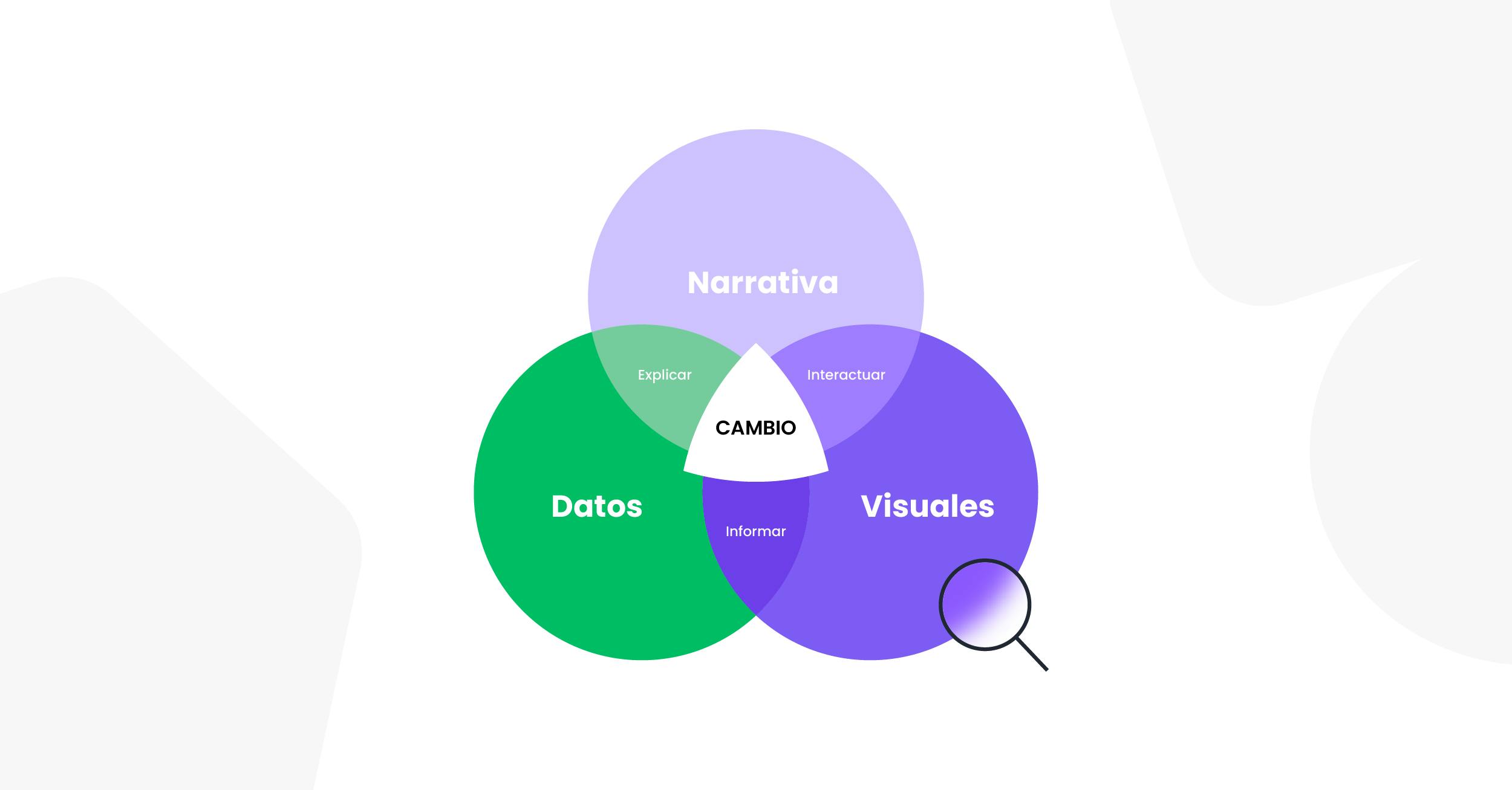
The three real ingredients to communicate with data
Communicating with data is not just about having the right information. What matters is how you show it. At Bunker DB, we experience this every day: data is useful only if it helps you understand and decide faster. Here are the three essential ingredients to make that happen:
- Data that speaks. It doesn't have to be just numbers. It can be user comments, qualitative insights, or standard metrics. What matters is that it makes sense for your goal and context.
- Visuals that show. A good chart is worth more than 20 rows in Excel. A dashboard that highlights key points helps you spot patterns instantly. That’s what turns data into action.
- A story that connects. This is the heart. Without a narrative, data is scattered. The story provides structure, context, and explains the "why" and "what for." And most importantly, it engages your team or client.
When you combine clear data, powerful visuals, and a compelling story, you unlock those moments of clarity that transform decision-making. Use these nine principles to connect those three elements effectively:
1. Data alone doesn't tell a story
Don’t assume that a chart or data table automatically conveys your message. Think carefully: Is this visualization necessary? What essential part of the data am I showing? How could it be interpreted? Are there alternative readings? As marketing professionals, we should never let the audience apply their own editorial judgment to our data. Every data point should support our perspective, and our focus should be on building and clearly communicating that point of view. That’s why the connection between the data and its visualization must be direct and unambiguous. If the data backs up your argument, the visualization should make it even more obvious.
2. Not all data needs to be visualized
Not every data point requires a visual. Often, our instinct leads us to create a chart just to communicate a number. Avoid overloading what's already obvious. A chart isn’t always necessary to make something meaningful. For example, in a monthly report, using a pie chart to show an 80% vs 20% split is unnecessary—just state, “80% of sales came from Product A.” If the data is already clear, don’t overcomplicate it with unnecessary visuals.
3. Keep your visualizations simple
No one wants to decode a chart just to understand the point. Focus on what matters. If you're trying to support an idea or drive a decision, make sure the visualization is clear and direct. Don’t fall in love with a pretty chart—make sure it actually communicates what you need it to. Don’t expect your audience to have the time or desire to do complex analysis. In fact, overly complex visuals can mislead. Avoid confusing elements like broken axes, lack of context, or 3D charts that distort meaning.
4. Decluttering: Less is more
This is a golden rule for clarity. Data visualization is more like telling a short story than writing a novel—you need to remove anything that’s not essential. If your report has a beautiful visual with three fonts, six colors, and trend lines reinforcing the obvious, chances are no one will get the message. Decluttering isn’t just aesthetic—it’s critical. Remove anything that doesn’t support your story: gridlines, borders, 3D effects, shadows, decorative elements. When in doubt, leave it out.
5. Your message defines visual hierarchy
Not everything deserves equal visual weight. Visualizing data means choosing where to focus attention. If you want to highlight a campaign’s jump in performance after optimizations, don’t bury it in a full historical series. Sometimes all you need is to guide the viewer’s eye. Use color sparingly to emphasize key data—one or two colors used effectively are more powerful than a rainbow without meaning.
6. Use simple structures to tell your story
Your audience doesn’t want to see everything—they want to understand what matters. Don’t overload a presentation with 15 charts if you only have 15 minutes. Don’t write a long email if you only have 3 minutes of your reader’s attention. Use simple storytelling structures to engage, contextualize, and drive decisions:
- Situation: Where are we?
- Complication: What challenge emerged?
- Resolution: What did we do? What was the impact?
7. Design for the user, not for yourself
A common mistake in BI teams is designing visuals like final artwork. But good visualizations are built for the viewer, not the creator. Structure your dashboards so they’re interactive and easy to filter by brand, channel, date, or key variables. This way, insights become actionable tools—not just static reports. Engage your audience, ask questions, and build interactivity wherever possible.
8. Give meaning to the numbers
A key metric (KPI) is not automatically understood. A number without context is just a number. If you show 10,000 sales and someone asks, “Is that good or bad?”, you missed the mark. Always provide context:
- Comparisons: “+23% vs last month”
- Relevance: “2x industry average”
- Impact: “Generated 1,500 qualified leads”
9. Pay attention to color, labels, and order
Effective data visualization isn’t just about data—it’s about design. Use color to create meaning—green for positive, red for negative. Ensure all labels are easy to read. Organize data logically—by value, alphabetically, or chronologically. A good test: show your chart to a colleague. If they don’t understand it within a few seconds, it needs refinement.

Conclusions
Data visualization is not just a technical skill—it's a strategic tool to communicate, influence, and drive smarter decisions. That’s why mastering these principles is key to turning numbers into concrete actions:
- Are your visualizations telling the right story?
- Does your team speak a common visual language?
- Are your data framed within your area’s storytelling?
- Are your dashboards easy to read, navigate, and act on?
A great visualization doesn’t just inform—it inspires smart decisions. Apply these principles and take your data communication to the next level.
References
Qlik & Accenture. (2022). The seven principles of data literacy. The Data Literacy Project. https://thedataliteracyproject.org/wp-content/uploads/2022/11/The-Seven-Principles-of-Data-Literacy-by-Qlik-and-Accenture.pdf
Duncan, D. (2018). Lies, damn lies and data visualization. CIOReview. https://data-visualization.cioreview.com/cioviewpoint/lies-damn-lies-and-data-visualization-nid-27117-cid-163.html
Federico Kalos
CMO @ Bunker DB